Content is King but so are Responsive Website Designs

With continuous technological improvements, the devices we use to access the internet are adapting both with regards to their software and their physical shape and size. With this, you as a brand need to adapt, ensuring your website can cater to the different device screen sizes. There’s nothing more frustrating for a customer trying to quickly access your website but they’re met with a website format not suited for their device and the information they want can’t be seen. This is where responsive web design comes into play.
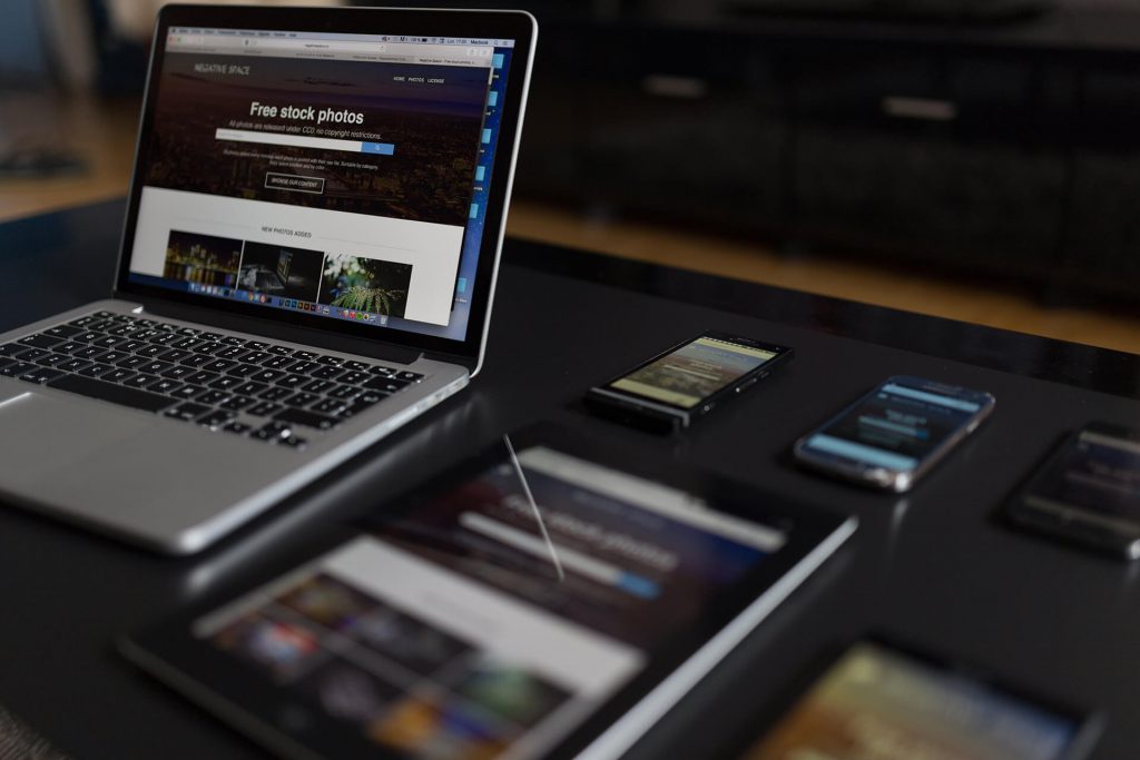
Responsive web designs ensure optimum user experience of a single site, across a range of devices – no more are the days where your brand needs multiple different websites to match the different device sizes. This is increasingly important where more UK households are using a variety of devices to browse the internet; nearly 80% of adults use their smartphones to access the internet.
Responsive websites automatically adjust to suit your user’s screen size, making your website become user-friendly, guaranteeing your users stay on your website for longer.
The three main benefits of adopting a responsive website design:
Improved user experience
You may be praised for having great content on your website but if the information your users want isn’t available where and when they want it or they find it difficult to navigate your website efficiently on their device, conversion rates will be low. “61% of people said that they’d quickly move onto another site if they didn’t find what they were looking for right away on a mobile site.” Responsive website design is an easy way to manage this.
Responsive websites automatically adjust to suit your user’s screen size, regardless of whether a user is accessing your website on a mobile device, tablet or desktop. Therefore, your user’s experience will remain the same even if they are returning to your website at different times, using different devices, allowing for seamless interaction with your brand online.
Ultimately, by improving your user’s experience with Responsive Website Design, where your website is device-friendly, your users are more likely to stay on your site for longer and lead to a greater amount of conversions. What’s not to like?
Search Engine Optimisation
Google understands the importance of good user experience. Because of this Google have now made responsive web design a factor when considering your website’s ranking.
To stay on Google’s good side, having a responsive web design
will allow you to rank higher on their search engine, enabling your web link to
stay visible to your users, at any time, on any device. Ultimately, this
can determine the success of your organic traffic, especially for mobile
devices, as a better ranking will improve the amount of traffic your website receives.
Stress-free web development process
Responsive website design not only reduces stress for your users but also for you as a brand.
Gone are the days where you’re trying to maintain two or three different websites for each separate device. Instead, employing a responsive web design means there is one URL meeting the needs of multiple devices and their users. This can reduce your costs and save you time, resources and money, as it drastically simplifies your web development process. Not only this but your brand image becomes more streamlined across the different platforms, improving the success of your brand’s online campaigns.
Fancy making your web design responsive?
Here at Barley house Agency, we can make these important changes to your website. You’ll be left with a website that’s professional and usable across multiple devices, allowing you to reach your digital goals.
Who are Barley House Agency? We are an Integrated Creative agency based in Hertfordshire who help brave brands be remarkable.
Get in touch with us today to find out how we can make your responsive website design remarkable.